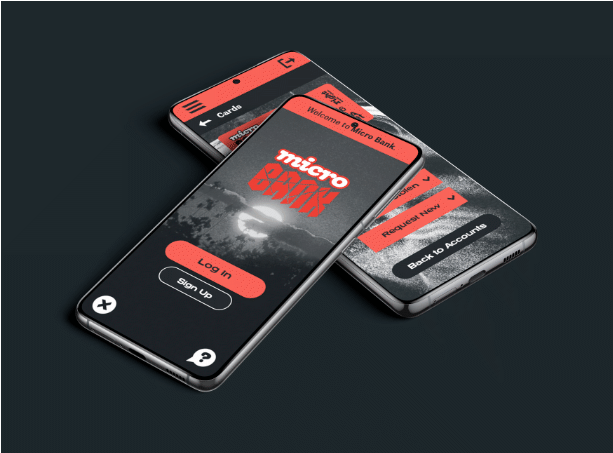
Micro Bank Mobile App
Micro Bank is a fictional neobank which aims to appeal to a younger audience.
You can read about some background behind the logo or keep reading for information on the mobile app design.
Detail
The screen size was chosen to be 360x800px as it was the most popular mobile phone screen size in October 2022 according to StatCounter. This fits the size of a Samsung Galaxy S20 or S21 which runs an Android operating system.
Target Audience Interviews
An interview with three members of the target demographic (18-25 years) indicated the three most desired additional features from a banking app were:
- Personalisation
- Self-service and Independence
- Customisation
Interviewees expressed interest in having the ability to personalise the visuals of the app through choosing a colour scheme, fonts, or a dark mode UI.
Self service included the ability to manage your own finances and tools to help you save money or track spending.
Customisation is similar to personalisation but with a focus on improved user experience, such as choosing different font sizes.
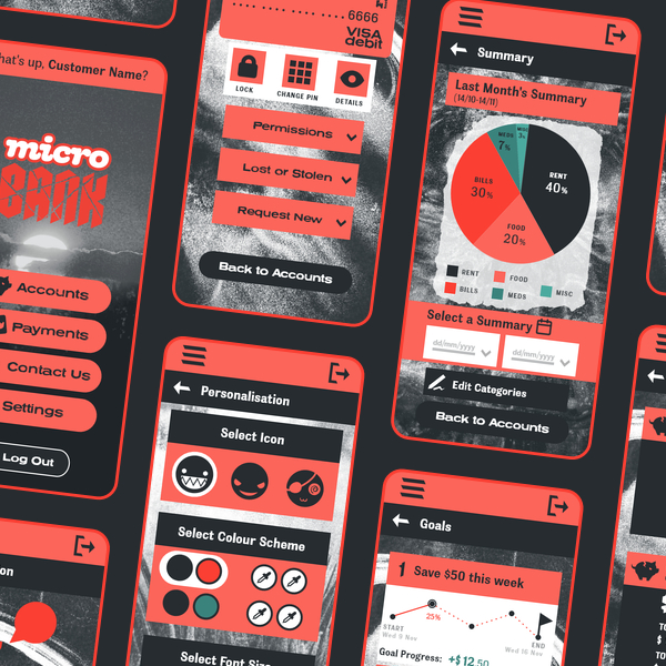
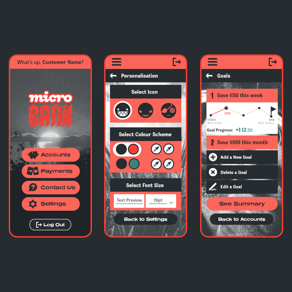
Based on this information I included personalisation, goals, and summary (spendings pie chart) pages in the app. I communicated a punk visual style through a limited colour palette, custom icons, and textured background images.
The tools used for this project include Adobe Illustrator for icons, Adobe XD for wireframing and prototyping, and Affinity Designer for the mockups.
App Feedback
Four users tried the app and completed a 10 question user experience survey which used a Likert scale (5 options from Strongly Disagree to Strongly Agree).
The highest scoring categories included:
- Visual Design (93.3%, most users selected Strongly Agree)
- App Functionality (86.67%, most users selected Agree or Strongly Agree)
Those testing the app and completing the survey commented postively on the app visuals.
Credits
Icons were customised from base open source Lucide.dev icons using glyphs from the logo typefaces and Adobe Illustrator.
Phone homepage icons are from ICONS8.
Try the App!
This app is a prototype so not every button leads somewhere, but you can get a better impression how the app feels by using it.
Click where there are no buttons to highlight clickable buttons.
Return to Portfolio