

Design Focus: Solarpunk Graphic
09 November 2023
Design Focus is a series of posts about designs that maybe don't belong in the Portfolio but I still want to share and focus on for the sake of a retrospective and learning purposes.
This time I'm looking at a design I made in early 2023 in February. I wanted to explore an early 2000's aesthetic as well as a Vectorheart [CARI] design. The square layout and chaotic composition was inspired by some of Bee Lever's designs (Mukkys World) [Instagram].
Here's the design:
Design Background
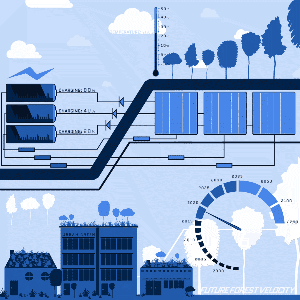
At the time Brisbane was going through a heatwave and I was sweltering in my sharehouse room that had no air con or fan. I was generally feeling a bit pessemistic about climate change action worldwide (and in my home country) and the generally substandard of private rentals I've experienced and how many of them aren't very liveable.
So part of my inspiration in creating this graphic was to draw attention to better ways of designing houses that might be more climate resistant (and cooler) while also drawing attention to renewable energy. Researchers have found that green roofs can improve biodiversity in cities, reduce temperatures of the roof, and make solar panels more efficient (see Study finds green roofs make solar panels more efficient [ABC News] and Green Infrastructure Research Group [University of Melbourne] for more).
If you are interested in a more detailed document, one key piece of research I found when creating this design was the Residential apartments sustainability plan [City of Sydney] published in 2015 by the NSW government.
Visual Design Elements
The design is thematically solarpunk which means it takes an optimistic viewpoint and aims to create enthusiasm for a sustainable future.
The visual root of the vectorheart aesthetic is the futurist movement so there is an emphasis on velocity or movement. This is communicated by the use of line, like the thicker ground line that intersects the top third of the design as well as the circuit lines. Literally there is a speed meter with years on the tick marks to represent that we are moving through time overlaid over a backdrop of trees. You can interpret this as it takes time to grow trees or the climate takes time to change.
Some of the design elements are obvious, like the shapes for the trees, buildings, lightning, and clouds. There is repetition of the trees in three of the quadrants; trees on the ground, trees on the tops of buildings, and trees floating in the air as abstract icons.
There is some text overlapping with the other elements which you can interpret as flavor text.
The colour theme is blue to represent temperature cooling as well as create a tranquil atmosphere.
Overall I like the cartoony nature of the graphic (like the cloud shapes). The visual style is intentionally flat as I did not want distracting elements, but if I were to return to this idea I would experiment with texture or image overlays to create additional depth.
Conclusions
This design is quite literal in its intentions and focus. I hope that it got some people thinking about how they can be more climate positive or do something to be more sustainable.
Leave a Comment
Comments
There are no comments. Maybe yours could be the first?
