scope filter visual design without the noise
The front page graphic of the Designer Report in a 2000s vector style.

Designer Report

I designed this 2000s era style vector graphic and layout in Y2K style for a designer report where I was lucky enough to interview transmedia designer Froyo Tam.

Detail

I used Froyo Tam's font Whisper from itemLabel in the design, both the vector and pixel version. These are visible in the button labels and page numbers.

I included a small number of navigational buttons at the bottom of the page to improve digital accessibility. Compared to having a larger navigation bar along the top, this reduces redundancy when screenreaders read the buttons in the interactive PDF. I discovered this technique thanks to this blog post Interactive PDF and accessibility by Ted Page.

Tools used include Adobe Illustrator and InDesign.
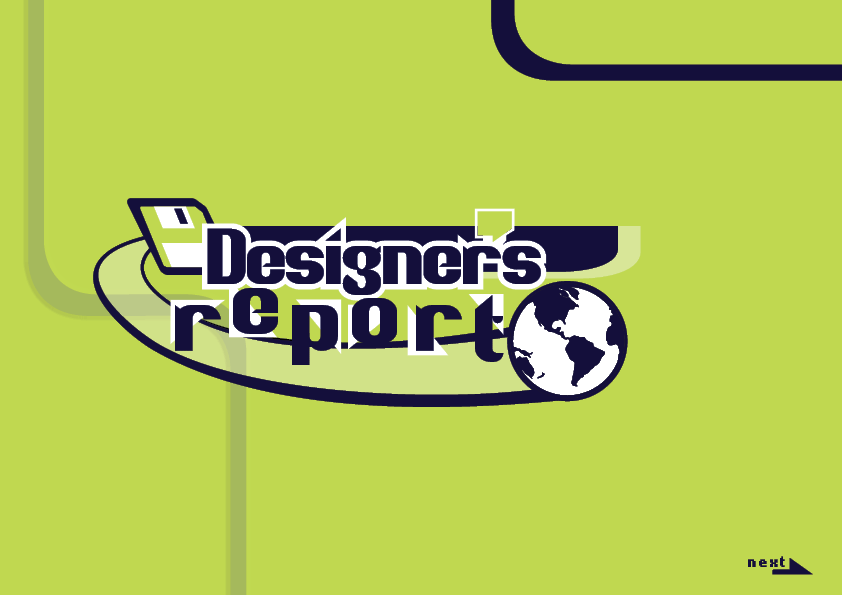
A 2000s style vector graphic using a sans serif modern blackletter font reads Designer's Report. The apostrophe is enlarged to look like a speech bubble. The background is neon green with white for highlights and dark purple for text, vector icon detail, and a next button and arrow at the bottom right. A stripe behind Designer's leads to a flopppy disk on an angle with a comet tail leading to an earth graphic after report. The text report has triangle shapes behind the letters to give a quirky memphis feel.
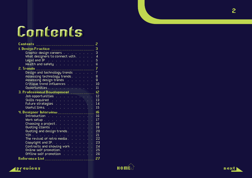
A Contents page with the heading in neon green using the Whisper font with a 3D effect and the background in dark purple. Text is neon green to contrast with the background. A page number in a pixel font is in the top right, with three navigation buttons along the bottom of the page. The previous and next buttons are in the corner and overlap with arrows. A home button is center aligned.  The Contents page has the major headings: 1. Design Practice 2. Trends 3. Professional Development 4. Designer Interview.
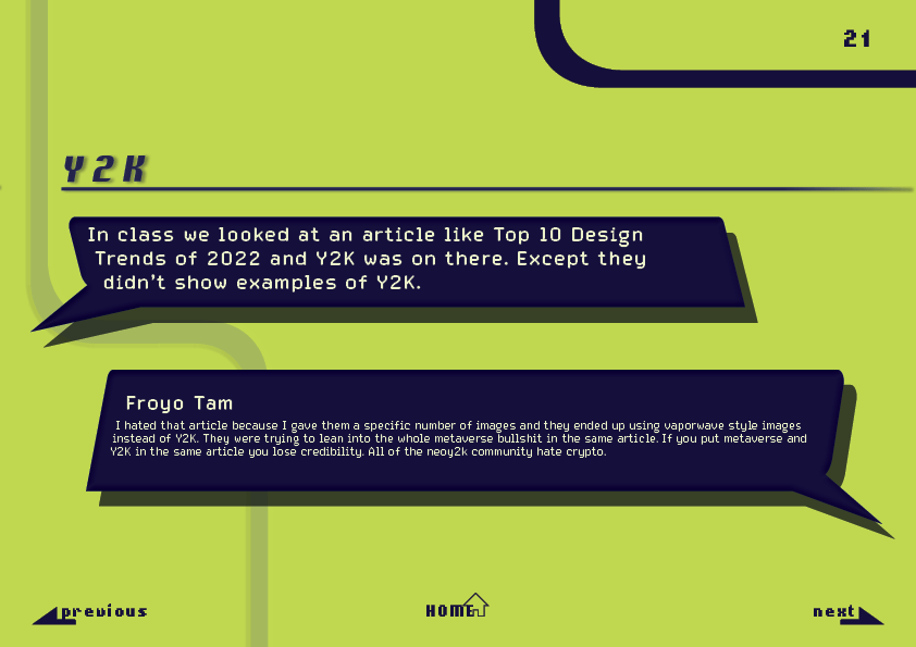
A heading in dark purple contrasts against a neon green background. A heading Y2K is above two speech bubbles. The interviewer speech bubble reads: In class we looked at an article like Top 10 Design Trends of 2022 and Y2K was on there. Except they didn't show examples of Y2K.  Froyo Tam replies: I hated that article because I gave them a specific number of images and they ended up using vaporwave style images instead of Y2K. They were trying to lean into the whole metaverse bullshit in the same article. If you put metaverse and Y2K in the same article you lose credibility. All of the neoy2k community hate crypto.
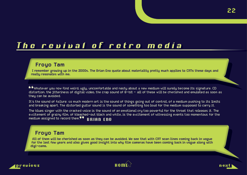
A reverse colour scheme with neon green text and a dark purple background.  The heading reads The revival of retro media. Froyo Tam says: I remember growing up in the 2000s. The Brian Eno quote about materiality pretty much applies to CRTs these days and really resonates with me.  The quote from Brian Eno reads: Whatever you now find weird, ugly, uncomfortable and nasty about a new medium will surely become its signature. CD distortion, the jitteriness of digital video, the crap sound of 8-bit - all of these will be cherished and emulated as soon as they can be avoided.  It's the sound of failure: so much modern art is the sound of things going out of control, of a medium pushing to its limits and breaking apart. The distorted guitar sound is the sound of things going out of control, of a medium pushing to its limits and breaking apart. The distorted guitar sound is the sound of something too loud for the medium supposed to carry it.  The blues singer with the cracked voice is the sound of an emotional cry too powerful for the throat that releases it. The excitement of grainy film, of bleached-out black and white, is the excitement of witnessing events too momentous for the medium assigned to record them.  Froyo Tam says: All of them will be cherished as soon as they can be avoided. We see that with CRT scan lines coming back in vogue for the last few years and also gives good insight into why film cameras have been coming back in vogue along with digi-cams.

Return to Portfolio